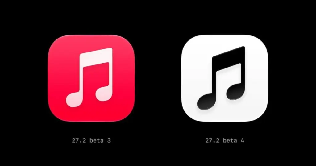
- Apple has replaced the signature red Apple Music app icon with a black-and-white design in iOS 27.2 beta 4.
- The eighth note graphic features a slightly sharper angle alongside internal interface refinements.
- The anticipated overhaul of the Apple Health application has been removed from this release cycle.
Visual Refresh in iOS 27.2 Beta 4
The release of iOS 27.2 beta 4 to developers has introduced a notable shift in company branding. The long-standing red Apple Music app icon has been replaced with a monochrome black-and-white version, as reported by 9to5Mac. In addition to the palette swap, the central eighth note emblem has been modified with a visibly sharper contour angle.
This aesthetic direction follows the recent appearance of a matching monochrome insignia spotted on the Apple Music Hall portal last month. Alongside the home screen icon revision, the fourth beta includes minor cosmetic adjustments within the Music app interface itself. The stark minimalist pivot has already sparked mixed feedback and criticism across social media channels.
Health App Redesign Postponed
Beyond audio streaming modifications, the iOS 27.2 beta 4 firmware confirmed adjustments to Apple’s deployment roadmap. While an overhauled Apple Health application was in development, the refreshed experience is no longer included in the current beta build, pushing its anticipated debut beyond the 27.2 cycle.
| Feature / Application | iOS 27.2 Beta 4 Changes | Deployment Status |
|---|---|---|
| Apple Music Icon | Swapped classic red for black-and-white; sharper musical note angle | Active in Developer Beta |
| Music App Interface | Supplementary in-app design tweaks | Active in Developer Beta |
| Health App Overhaul | Comprehensive redesign of dashboard and tracking | Removed from iOS 27.2 |
The transition toward high-contrast monochrome iconography highlights a broader aesthetic exploration for Apple’s native services. Meanwhile, the omission of the revamped Health suite signals that users will need to wait for subsequent major updates before receiving core platform interface redesigns.



This sudden pivot toward monochrome feels like a massive shift in Apple’s design philosophy. Do you think this minimalist aesthetic will eventually roll out to the rest of their native apps, or is it strictly tied to the Music brand? I’d love to know what sparked the change.